Blog
Category
Follow Us
I need a new website - where do I start?
A website is one of your strongest online marketing tools. By not having one, you restrict the number of potential clients that may find you. If you are looking for a new website do not fret. There are many options to consider.
Option 1
Cheapest is use a website builder. They give you a standardised templates that you can populate with content. This is a quick fix for your business. It will give you an online presence while you get your business up and running. Note to remember: such builders can be restrictive and not necessarily easy to use.
Option 2
Employ a freelancer who can help you develop your website and manage the process yourself.
Option 3
Get everything under one roof. An agency who will design, build and manage the complete process. This is the preferred option – handing your project over to experienced professionals.
You can develop your own website however you want. It is your choice, but we have found in recent years that our clients want something more bespoke at an affordable price and this is where we can step in with a two-stage development.
Contact details are in a visible place
The main objective of your website is to attract potential clients. Having an e-mail address and phone number in a visible place is crucial. Don’t forget to have a ‘contact us’ page. If you have a contact us form to fill in on your website, make sure it goes to someone that will actually read it. If you don’t use it, replace it with a phone number.
Many websites have a pop-up box with contact information that moves throughout the website that constantly invites you to contact the desired company.
Optimised high quality images
An image speaks a thousand words. When pictures take too long to load, you cannot guarantee people will have the time or patience to wait. We highly recommended you optimise every photo on your website. Avoid having them as huge files. Talk to your developer about this.
Simple navigation
Another thing worth remembering is navigation on your website. The menu should not be too complex. Visitors should be able to find what they need as quickly as possible. Remember the rule of clicking: less navigation through other pages to find what you are looking for. The more pages you must view to find something, the less likely the visitor is of staying on your website.
Social icons
Social media sites are some of the major places where potential clients may find you. If you have company Instagram, Twitter or Facebook accounts, show this on your website. It can be shown as latest news, in a footer or as icons close to the menu bar.
Adapted to all screens
Is your company website adapted to a mobile screen? Is it working properly on every browser (Chrome, Mozilla, Explorer)?
If you are using ‘Google Analytics’ to see your website statistics, you will be able to see what devices and browsers are used by visitors to your website. You may see that most view your page on their phone, so make sure that all elements are visible correctly, especially when you buy ready to use template deigned by someone else.
Colour selection
There are a couple of issues here.
Try to avoid a dark background. The easiest way to read on screen is having a white background and black text on it. Obviously, you can use colour for shorter description, but be careful with text heavy information like news for example.
Mix of colours on your website. Chose less and keep it simple rather than lots of different ones.
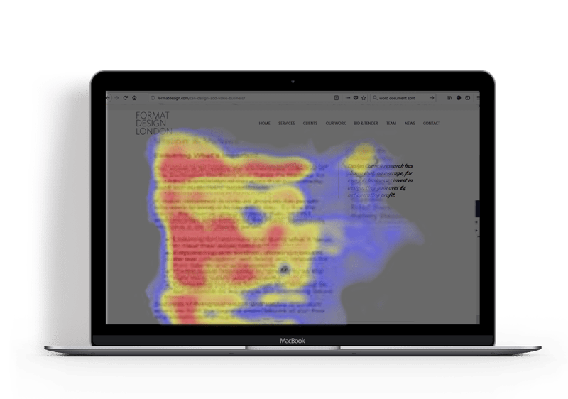
Extra tip!
When people view something on the internet, they scan the website in the shape of an “F” pattern (see the picture below). This means you should put your top/best information on the left rather than having important news on the right.